


 Sonar Tracker
KS5 reports
KS5 report tools and options
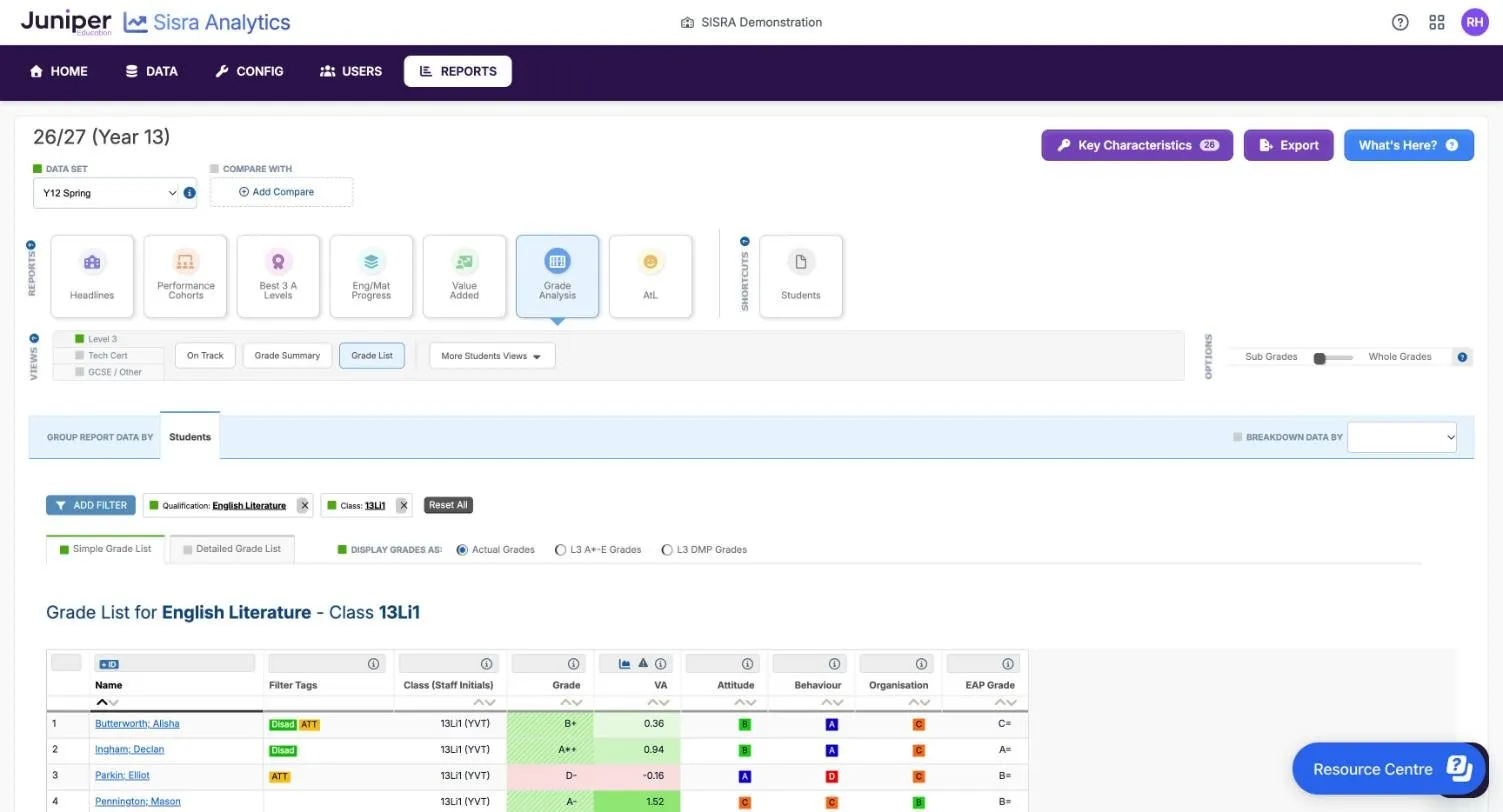
Every KS5 report in Sisra Analytics sits in the same frame. The data set and any comparison are at the top, followed by bars for reports, views and options, a grouping bar, filters and the table. This page describes each tool and option, with its default, so you can change what a report shows and know what you are looking at.
Where to find it: select REPORTS, then KS5, then a report under STANDARD REPORTS. Open the KS5 reports gives the steps.
Who can see it: authority groups with View EAP KS5 Reports, which Admin and User have by default. Groupings your authority group cannot open are hidden. Whole Cohort needs View Headline Report, Students needs View Student Report, and the others need View Qualification Report. Headlines, Performance Cohorts, Best 3 A Levels, Eng/Mat Progress and Value Added also need View Headline Report.
The examples use the demo school’s 26/27 cohort, this year’s year 13. Its Y12 Spring collection holds predicted grades from the spring term of year 12, and its Targets data set holds the students’ targets.
The report page
Section titled “The report page”From the top, each report has these parts:
| Part | What it shows |
|---|---|
| Header | The cohort, such as 26/27 (Year 13), the DATA SET list with an i icon, and COMPARE WITH |
| Key Characteristics, Export, What’s Here? | Buttons at the top right. The number on Key Characteristics is the count of students in the report |
| REPORTS | The seven reports, as on the reports home. The open report has an outline in its own colour |
| SHORTCUTS | Students, which opens Grade Analysis with a row for each student |
| VIEWS | The performance level, the report’s views, and a list such as More Students Views |
| OPTIONS | Toggles for Count or Percent, Standard or Cumulative, and Sub Grades or Whole Grades |
| GROUP REPORT DATA BY | What each row is, such as a qualification or a student |
| BREAKDOWN DATA BY | Splits each row by the values of one filter |
| ADD FILTER | Opens the Filters panel. Filters you apply show as boxes beside it, followed by Reset All |
| UPDATE STUDENT INCLUSION | In Performance Cohorts, Best 3 A Levels and Eng/Mat Progress only |
| DISPLAY GRADES AS | In Grade Analysis and the student panel only: actual grades or equivalent grades |
| The table | Most tables end with a Summary row for everyone in the report |
The grouping bar takes the colour of the open report. There is no Pin This Report at KS5.
Reports, views and groupings
Section titled “Reports, views and groupings”Choose a report on the REPORTS bar, a view on the VIEWS bar and a grouping in GROUP REPORT DATA BY. AtL is the report of your school’s Attitude to Learning (AtL) judgements.
| Report | Views | Groupings |
|---|---|---|
| Headlines | Headlines Summary | Whole Cohort |
| Performance Cohorts | L3 Overall, A Level, Academic, Applied General, Tech Level, Tech Cert | Groups, Students |
| Best 3 A Levels | Best 3 A Levels | Groups, Students |
| Eng/Mat Progress | English Progress, Maths Progress | Groups, Students |
| Value Added | Value Added | Groups, Faculties, Qualifications, Classes, Students |
| Grade Analysis | On Track, Grade Summary, Grade List | Groups, Faculties, Qualifications, Classes, Students. Grade List works at Students only |
| AtL | One for each of your school’s AtL categories, such as Attitude | Groups, Faculties, Qualifications, Classes, Students |
The grouping sets what each row is:
| Grouping | Each row is |
|---|---|
| Whole Cohort | Everyone in the report |
| Groups | One value of one filter, such as Disadvantaged. Name gives the filter and Filter Value the value. Filters with more than 15 values are left out |
| Faculties | A faculty, if your school has set faculties up |
| Qualifications | A qualification |
| Classes | A class in one qualification. The first column becomes Name (Staff Initials) |
| Students | A student. Each name is a link to the student panel |
For Classes, and for Grade List, the report needs a qualification. The Filters panel opens by itself, with the qualification box marked red. Until you choose one, the page says “The following required filters have not been selected: Qualification”.
Move between reports
Section titled “Move between reports”Each REPORTS button opens its report at its starting view and grouping. It keeps your comparison, breakdown and display options, and any filters it can. It clears filters that a drill-down added.
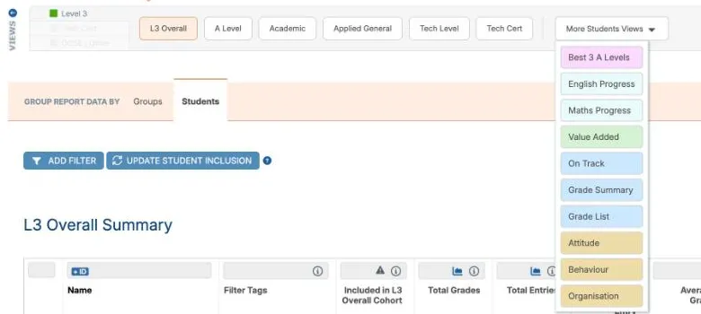
The list at the right of the VIEWS bar holds the views of other reports at the same grouping. Its name follows the grouping, such as More Students Views. Each view in it is coloured like its report. Unlike the REPORTS buttons, this list keeps every filter you have applied.
The performance level
Section titled “The performance level”The left of the VIEWS bar chooses the performance level. A report shows one level’s qualifications at a time. Levels with no grades in the data set are not listed. A level the report cannot show is greyed out, as Tech Cert is in Value Added.
| Level | Qualifications |
|---|---|
| Level 3 | A levels, AS levels, the Extended Project, and approved applied general and tech level qualifications |
| Tech Cert | Approved level 2 technical certificates |
| GCSE / Other | GCSEs, such as English and maths resits, and other qualifications, such as level 1 and entry level |
In the demo school’s Y12 Spring, Level 3 holds 16 qualifications and Tech Cert holds IT L2. GCSE / Other holds English Resit GCSE and Maths Resit GCSE. Eng/Mat Progress opens at GCSE / Other, and the Tech Cert view of Performance Cohorts moves the level to Tech Cert.
Filters
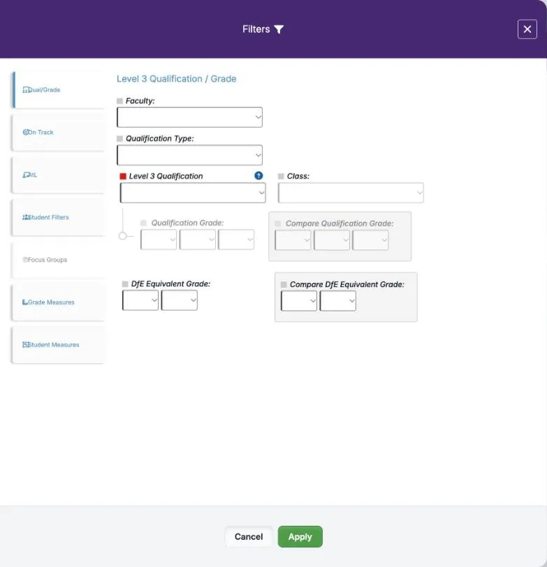
Section titled “Filters”ADD FILTER opens the Filters panel. Choose a tab on the left, make your choices, then select Apply. A tab in use shows a green number.
| Tab | What it narrows the report to |
|---|---|
| Qual/Grade | A Faculty:, a Qualification Type: such as A Level (Overall) or Applied General, a qualification and a Class:. Also grades above, at or below a grade you choose, in Qualification Grade: or DfE Equivalent Grade: |
| On Track | All, Above Track, On Or Above, On Track or Below Track |
| AtL | Grades with the AtL judgements you tick, such as Poor in Attitude. Also No Judgement and Unknown Judgement |
| Student Filters | Students with the filter values you tick, such as Disadvantaged |
| Focus Groups | Students in the focus groups you tick. It is greyed out if the cohort has none |
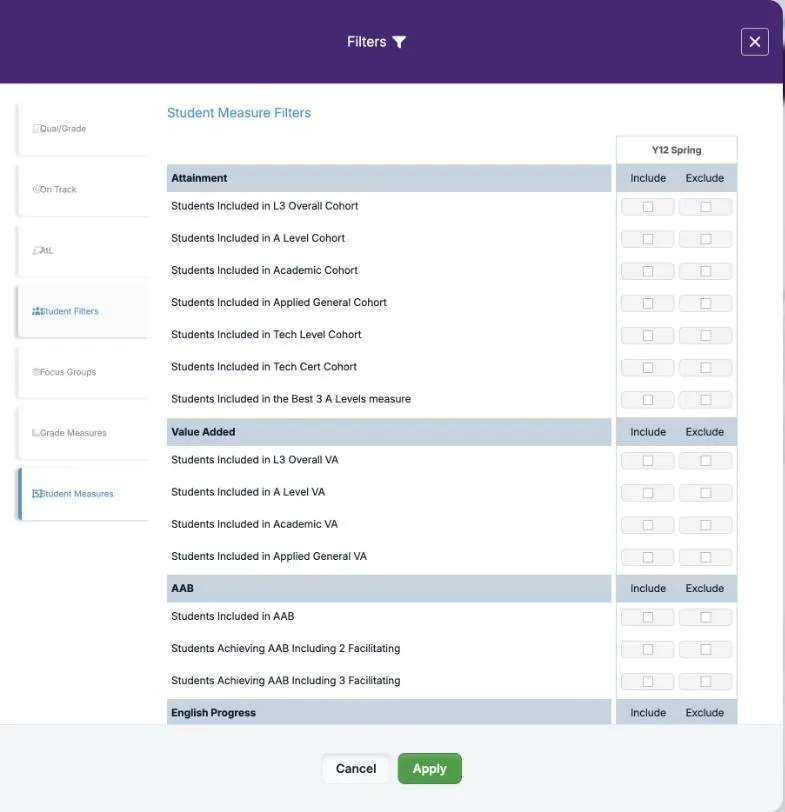
| Grade Measures | Grades included in, or left out of, Grades Included in VA or Grades Included in Best 3 A Levels |
| Student Measures | Students included in, or left out of, a headline measure, such as Students Included in L3 Overall Cohort |
The qualification box is named after the level, such as Level 3 Qualification, and lists only that level’s qualifications. To filter another level’s qualifications, change the level on the VIEWS bar first. With a comparison set, Compare Qualification Grade: and Compare DfE Equivalent Grade: filter on the other data set’s grades.
Values from the same filter widen the group: Female and Male together include everyone. Values from different filters narrow it: Female and Disadvantaged include disadvantaged girls only. Two focus groups include students in either group.
Each filter you apply shows as a box beside ADD FILTER, such as “Qualification: English Literature”, with a cross to remove it. Reset All removes them all after you select Yes in Reset All Filters?. The question fades after about three seconds, so select Yes straight away.
Some filters are added for you. Value Added adds “Grade Headline Measure: Grades Included In VA”, with a padlock and no cross. A drill-down adds a filter that does not show as a box.
Breakdown Data By and GAP
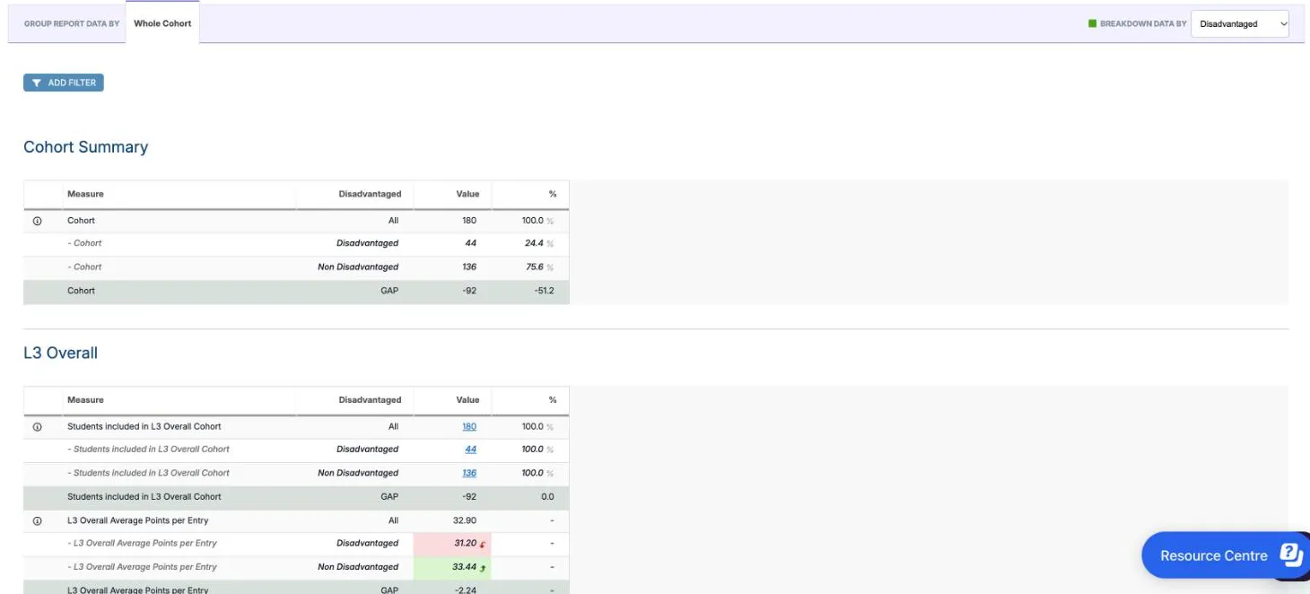
Section titled “Breakdown Data By and GAP”BREAKDOWN DATA BY splits each row by the values of one filter, under a row for everyone, All. Choose the filter from the list: a green square shows that a breakdown is set. Filters with more than 15 values are not listed, and the list is hidden when you group by Groups.
| Colour | Meaning |
|---|---|
| 33.44 light green, curved up arrow | The group’s figure is higher than All |
| 31.20 pink, curved down arrow | The group’s figure is lower than All |
When the filter has two values, a grey GAP row gives the first value’s figure minus the second’s. In the demo school’s Headlines, broken down by Disadvantaged, 44 of the 180 students (24.4%) are disadvantaged. Their L3 Overall Average Points per Entry is 31.20, against 33.44 for the other 136. So the GAP is 31.20 − 33.44 = −2.24.
Confidence limits have no breakdown rows. Their i says “Due to the complexity of the calculation, it is not possible to produce Breakdown values for this figure.”
Compare With
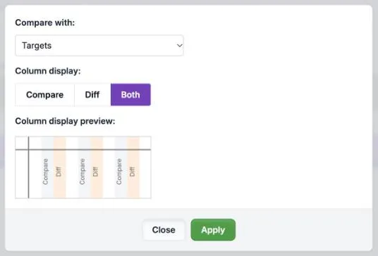
Section titled “Compare With”Add Compare, under COMPARE WITH, sets another published data set for the same cohort beside the one you are viewing. For example, set Targets beside Y12 Spring. In the dialog, choose the data set in Compare with: and the columns in Column display:, then select Apply.
| Column display: | What it adds after each column |
|---|---|
| Compare | The other data set’s figure, in a grey column with Compare in its heading. This is the default |
| Diff | The difference between the two, in an orange column with Diff in its heading |
| Both | Both columns |
Column display preview: shows the layout before you apply it. The box then reads “Targets (Compare)”, with an edit icon to change the comparison. Clear Compare, the cross beside it, removes it without asking.
Most figures are coloured against the other data set’s. In Headlines, the confidence limits are not.
| Colour | Meaning |
|---|---|
| 10 ↑ light green, up arrow | Higher than the other data set’s figure |
| 32.90 ↓ pink, down arrow | Lower than the other data set’s figure |
| No colour | The same |
In the demo school’s Headlines, L3 Overall Average Points per Entry is 32.90 for Y12 Spring against 36.27 for Targets, a difference of −3.37. L3 Overall VA is 0.29 against 0.63.
The colours show which figure is higher, not which is better. In Grade Analysis, art and design’s 18 grades Below Track, against 0 for Targets, are light green with an up arrow. Read the column heading before the colour.
Moving to a report that the other data set cannot show clears the comparison. For example, Targets has no AtL judgements. Before opening AtL, Sisra warns that “The compare dataset will be cleared by this navigation”, and asks whether to continue.
The options toggles
Section titled “The options toggles”The OPTIONS toggles sit at the right of the VIEWS bar. A toggle that does not apply to the view is not shown.
| Toggle | What it does | Default |
|---|---|---|
| Count or Percent | Counts or percentages in the columns that count grades, students or judgements | Count |
| Standard or Cumulative | Single grades, such as A*, A and B, or ranges from the top grade, such as A* - A and A* - B. In Grade Summary and AtL | Standard |
| Sub Grades or Whole Grades | Whether sub-grades count when a grade is compared with an expected grade or with the other data set’s grade | Sub Grades |
Your school’s administrator sets the defaults for everyone in KS5 Report Settings. The table gives the demo school’s settings, which match the KS3/4 defaults.
Sub-grades are the +, = and - after a grade, such as B-. With Sub Grades, a B- against an expected B+ is below track. With Whole Grades, both are a B, so it is on track. The toggle changes:
- the Above Track, On Track and Below Track columns of On Track, and its comparison columns
- the On Track filter in every report
- the colour of Grade in the Grade List and the student panel
It does not change any points.
Display Grades As
Section titled “Display Grades As”DISPLAY GRADES AS, above the table in Grade Analysis and the student panel, chooses how grades are shown. The options follow the performance level:
| Level | Options |
|---|---|
| Level 3 | Actual Grades, L3 A*-E Grades, L3 DMP Grades |
| Tech Cert | Actual Grades, L2 Tech Cert Grades |
| GCSE / Other | Actual Grades, Challenge Points Bands |
Actual Grades is the default wherever it is offered: at Qualifications and Classes, and in the Grade List. In On Track and Grade Summary it is greyed out at Groups, Faculties and Students, and L3 A*-E Grades is chosen. Its question mark explains: “it’s only possible to group grades of different types into a single table by displaying them as DfE Equivalent grades.”
The choice changes three things:
- Grade Summary: with Actual Grades, one table for each kind of grade, such as A Level and BTEC Single. With an equivalent, one table with every qualification converted
- Grade List: an equivalent adds a DfE Equivalent Grade column
- Average Grade: with L3 A*-E Grades or L3 DMP Grades, every level 3 average uses that scale. With Actual Grades, each qualification uses its own, such as distinction, merit and pass for applied general qualifications
In the demo school, BTEC Science’s average is Merit+ with Actual Grades and C= with L3 A*-E Grades. Sisra converts grades by their points, using the DfE’s average grade boundaries. Select the i on Average Grade to see them. Attainment: points per entry and average grade explains the points.
Columns, sorting and charts
Section titled “Columns, sorting and charts”Each column heading has a strip of icons above it and sort arrows below:
| Icon | What it does |
|---|---|
| Chart | Opens the column as a chart, such as Chart for VA. The chart’s menu has Download Image |
| i | Describes the column, often with how it is calculated |
| Warning triangle on a heading | Warns that the figures include students or grades that do not count in the headline figures |
| Warning triangle by a value added figure | Says which year’s national data the value added uses, such as “Calculated using ‘2025 Revised’” |
| Funnel | Opens Residual Exclusions, from the Residual heading. It turns green while exclusions apply |
| Up and down arrows, below the heading | Sort the table by the column, in either direction |
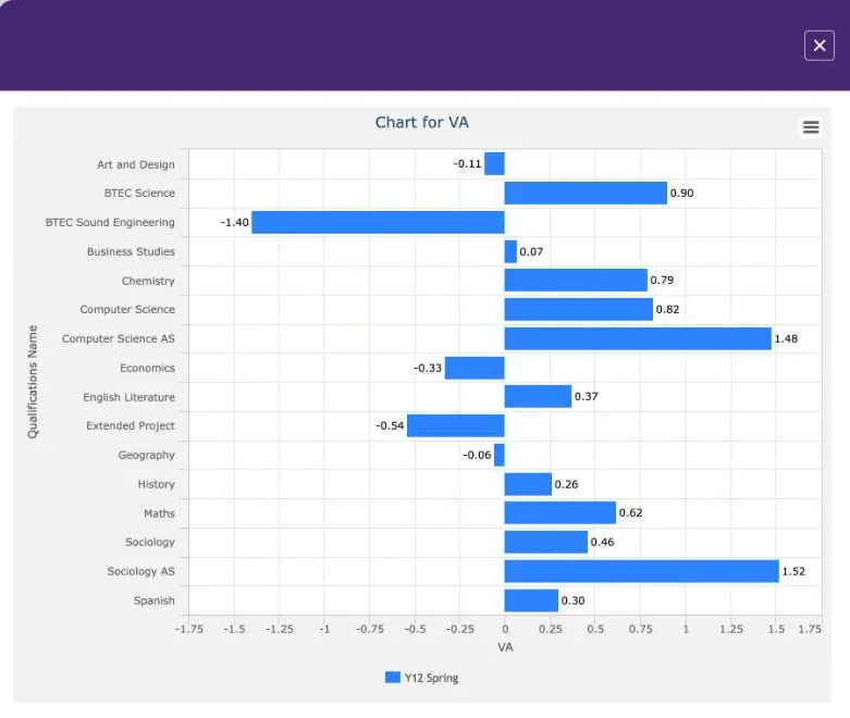
Drill down to students
Section titled “Drill down to students”Blue, underlined figures are links to the students behind them, with a filter added for you. In Headlines, for example, select 180 beside Students included in L3 Overall Cohort. Performance Cohorts opens with a row for each of those 180 students, and its summary gives 32.90 points per entry, as Headlines does. Select a student’s name to open the student panel: see Student reports.
Update Student Inclusion
Section titled “Update Student Inclusion”In Performance Cohorts, Best 3 A Levels and Eng/Mat Progress, each view starts with every student in the cohort. That includes students who do not count in its measure, so the Summary row can differ from Headlines. A warning triangle on the column of who is included explains this. It says the report “includes at least 1 student who is not counting towards the Headline figures for this measure”.
UPDATE STUDENT INCLUSION replaces any student measure filters with the one for the view you are on. In Maths Progress, that is “Student Headline Measure: Students Included In Maths Progress: Included”. Other filters, such as Gender, stay. The button then greys out.
| View, in the demo school’s Y12 Spring | Summary before | Summary after, as in Headlines |
|---|---|---|
| L3 Overall: average points per entry | 32.92 | 32.90 |
| Best 3 A Levels: average total points | 86.80 | 90.38, for 158 students |
| Maths Progress: average progress | 3.73 | 0.73 |
The maths figure moves the most, because students outside the measure who have maths grades are averaged in.
Residual Exclusions
Section titled “Residual Exclusions”A residual compares a student’s result in one qualification with their average across all their qualifications in the data set. Residuals explains how Sisra works them out.
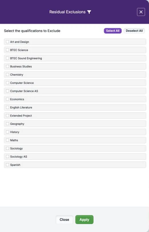
To leave some qualifications out of every student’s average, such as vocational ones, select the funnel in the Residual heading. In Residual Exclusions, tick the qualifications under “Select the qualifications to Exclude”, then select Apply. Select All and Deselect All tick or clear every box.
The funnel turns green, each excluded qualification’s residual reads Excl, and Sisra works out the others again. In the demo school, excluding BTEC Sound Engineering moves BTEC Science’s residual from −2.22 to −2.81, and economics’ from −5.39 to −6.00.
Exclusions stay while you move between views at the same performance level. Sisra clears them, without warning, when you change the level or open a report from the reports home.
Key Characteristics
Section titled “Key Characteristics”Key Characteristics gives the number and percentage of students in the report with each filter value. The number on the button is the count of students in the report. It follows the report’s grouping, filters and drill-downs, so it can describe one class or the students in one measure. Export saves it as a spreadsheet, and Close closes it.
The count differs from report to report. In the demo school’s Y12 Spring, Headlines counts the 180 students in the headline figures, and Performance Cohorts lists all 182 students. Grade Analysis shows 181, and one English literature class 26. In Headlines, 73 of the 180 students (41%) are female and 107 (59%) male.
Data Set Information
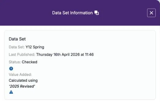
Section titled “Data Set Information”The i beside DATA SET opens Data Set Information. It gives the data set’s name, when it was last published and its status. It also names the national data its value added uses: for Y12 Spring, “Calculated using ‘2025 Revised’”. Which year’s national data explains why a current cohort uses an earlier year’s data.
Colours
Section titled “Colours”| Where | Colour | Meaning |
|---|---|---|
| VA, Residual, and value added columns such as Average L3 Overall VA | 0.62 green and -0.11 pink, deeper the further from 0 | Above or below 0 |
| Grade, in the Grade List and the student panel | B+ green and striped, B light green, D- pink | Above, on or below the expected grade. With a comparison, higher or lower than the other data set’s grade |
| Avg EAP Diff and EAP Diff columns | 0.1 green and striped, 0.0 light green, -0.4 pink | Above, at or below 0 |
| Columns that show who is included | Y light green | The student counts in the measure |
| AtL judgements | Letters in your school’s colours | The judgement. Point to a letter to see its name |
| Filter Tags | Your school’s colours, such as Disad in green in the demo school | Your school’s tags for filter values |
The colours in this guide are those of the Red/Green Theme, the default. Your school can choose another theme for tables and charts: see Colour Theme.
Export
Section titled “Export”| Control | Where | What it does |
|---|---|---|
| Export | The top right of a report | Downloads the report as a spreadsheet, with its publishing details and the options chosen |
| Download Image | The menu on each chart | Saves the chart as an image |
| Export | Key Characteristics | Downloads the counts |
| Export Table Data, Export All Headlines | The trends reports | Export the trends tables |
| Broadsheet Exports | REPORT DETAILS, on the reports home | Exports the report’s grades |
The KS5 reports have no print button. Exports hold personal data about students, so store, share and delete them as your school’s data protection policy says. Export published data covers the other exports.
Options that stay set
Section titled “Options that stay set”Your choices go with you as you move between reports and views. They include the data set, the comparison, the breakdown, the toggles and, where a report allows, your filters. Opening a report from the reports home starts again with your school’s defaults. This differs from KS3/4, where choices last for up to 48 hours.
To clear your choices:
- select Reset All, then Yes, to remove every filter
- select Clear Compare to stop comparing
- choose the blank entry in BREAKDOWN DATA BY to remove a breakdown
What’s Here? opens a panel that explains the buttons, filters, columns and comparison options. It says you can use your browser’s back button to undo an action or go back to a previous report, with your settings still applied.
A link to a report stops working after 48 hours. Sisra then says “Unknown report settings were specified”, so open the report again from the reports home.