


 Sonar Tracker
KS3/4 reports
Data Collaboration in the reports
A KS3/4 report published with Sisra Data Collaboration compares your school’s figures with those of other schools that use Sisra Analytics and took part. This page shows where the collaboration appears in the reports, and how to read its columns, colours and warnings. About Sisra Data Collaboration explains how the collaboration works.
Where to find it: any KS3/4 report published with Data Collaboration on. On the reports home, these reports show DC INCLUDED.
Who can see it: everyone who can open the report.
Your administrator chooses the collaboration event when publishing, in Collaboration Data:. In the demo school, the 26/27 cohort’s year 10 collections use the 2024 event, window 2: 1,594 schools and 301,947 pupils. The 25/26 leavers’ Exams uses the 2026 event, window 1: 1,578 schools and 218,741 pupils. The demo school’s KS2 scores for 25/26 are not official.
The Data Collaboration bar
Section titled “The Data Collaboration bar”The DATA COLLAB bar sits below the toolbar on every report. A control that does not apply to the report shows N/A :, and the bar is hidden in Track.
| Control | What it does |
|---|---|
| i | Opens Dataset Information: the event and window, the numbers of schools and pupils, when the figures were produced, and the rules and estimates used |
| People icon | In the Grades area, opens the Subject Progress Index (SPI) qualification groupings. See Subject Progress Index |
| Displaying Collab. Data : (two eye icons) | Shows or hides the blue collaboration columns, and the collaboration rows in the Transition Matrix. The label changes to Hiding Collab. Data : |
| Actual : and the difference icon | In the Transition Matrix, shows your percentages or their differences from the collaboration’s |
| “All Data Collaboration figures from” | The event and window, such as 2024 Collab - Window 2 |
Collaborative headlines
Section titled “Collaborative headlines”On the Headlines Summary, two blue columns follow your school’s figures for each measure:
| Column | What it shows |
|---|---|
| Collaboration Data | The measure across all the pupils in the collaboration |
| The data set’s name and vs. Data Collab. (Diff), such as Y10 Summer vs. Data Collab. (Diff) | Your figure minus the collaboration’s |
Your figure is light green with an up arrow when it is better than the collaboration’s. It is pink with a down arrow when it is worse. For a measure with NOT in its name, a lower figure is better. Summary shows the colours.
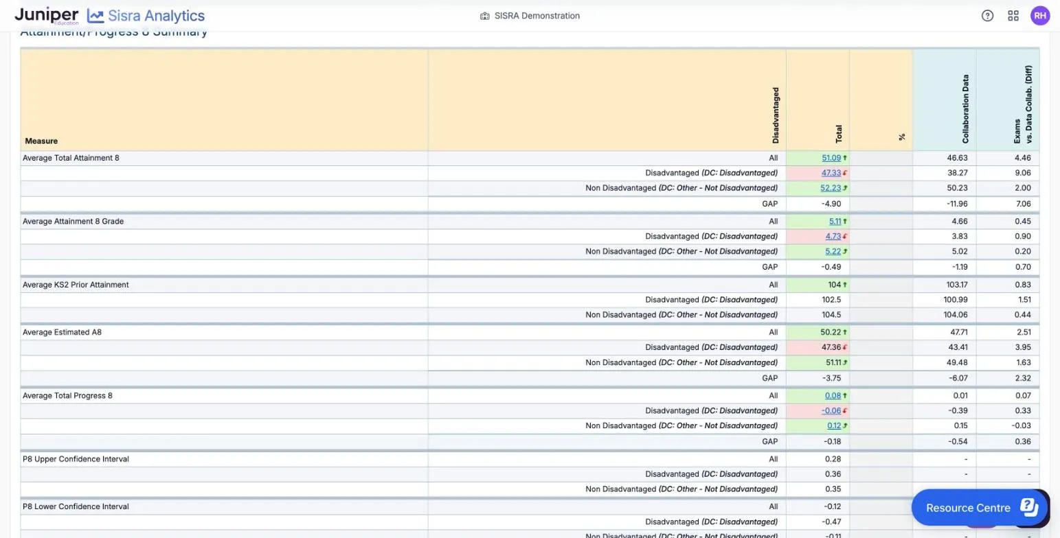
In the 25/26 leavers’ results, 55.2% of pupils have grade 5 or above in English and maths, against 45.9% in the collaboration. The difference column shows 9.3 %, which is 9.3 percentage points. Students NOT Achieving 9-5 in English or Maths is 21.9% against 32.5%, and is light green, because fewer is better.
In the 26/27 cohort’s Y10 Summer predictions, average Attainment 8 is 40.30 against 46.28: a difference of −5.98. The collaboration figure comes from 2024 exam results, and the school’s from year 10 predictions.
Filters on the Filters tab change your figures, but the collaboration’s figures stay those for all its pupils. To compare one group with the same group elsewhere, use a breakdown.
Like-for-like comparisons
Section titled “Like-for-like comparisons”Your school’s key filters, Disadvantaged, Gender and SEN, carry a small blue diamond in the Breakdown : list. Choose one, and each group’s row compares with the same group in the collaboration. Each row is labelled, such as “DC: Disadvantaged” or “DC: Other - Not Disadvantaged”. Other filters compare every group with all pupils in the collaboration.
In the 25/26 leavers’ results:
- disadvantaged pupils average 47.33 in Attainment 8, against 38.27 for disadvantaged pupils in the collaboration: +9.06
- other pupils average 52.23, against 50.23: +2.00
- the school’s gap is 47.33 − 52.23 = −4.90, and the collaboration’s is −11.96
So the school’s gap is 7.06 points narrower than the collaboration’s. With a filter that has two values, a GAP row shows both gaps for most measures, and the difference between them: see Breakdown and GAP.
In a breakdown, each group’s colour compares it with All in your school, not with the collaboration. So disadvantaged pupils’ 47.33 is pink, although it is 9.06 above the collaboration’s.
The key filters come from your administrator’s key filter mapping. Without it, there are no like-for-like comparisons: see Map key filters. In a girls’ school, for example, your administrator can choose Female in All of the students in this cohort are:. The Breakdown : list on the Headlines Summary then has a Data Collab - Added Filters section. It compares your pupils with collaboration pupils who have the same value, as well as with all pupils.
The colour scale and warning triangles
Section titled “The colour scale and warning triangles”The Data Collaboration Legend, below the Grades reports, explains the shading of SPI cells and three warning triangles. Colour Coding runs in ten shades from dark red, Negative Diff, to dark green, Positive Diff.
| SPI | Shade |
|---|---|
| 2 or more | Darkest green |
| 1.5 to 1.99 | Fourth green |
| 1 to 1.49 | Third green |
| 0.51 to 0.99 | Second green |
| 0 to 0.5 | Lightest green |
| −0.01 to −0.5 | Lightest red |
| −0.51 to −1 | Second red |
| −1.01 to −1.5 | Third red |
| −1.51 to −2 | Fourth red |
| Below −2 | Darkest red |
In the 25/26 leavers’ results, history’s SPI of 0.81 is the second green, and religious studies’ −1.37 the third red.
| Triangle | What the legend says | What it means |
|---|---|---|
| Blue | “Caution, one of the following applies: (1) Low cohort in the Data Collaboration (DC) for this qualification (1a) DC data may be grouped with other qualifications. (2) Qualification unapproved in this DC year.” | Few pupils in the collaboration took the qualification, so it may be compared with a group of similar ones. Or the qualification was not approved that year |
| Purple | “Difference figure calculated using collaboration data with low student counts.” | The collaboration’s average for that KS2 score rests on 10 to 24 grades |
| Pink | “Difference cannot be calculated due to suppression of Collaboration Data.” | Fewer than 10 grades, so Sisra hides the average and shows no SPI |
No warning triangles appear in the demo school’s 25/26 Grades Overview.

Subject Progress Index
Section titled “Subject Progress Index”SPI compares a pupil’s grade in a qualification with the average for collaboration pupils in the same kind of subject. It uses only those with the same KS2 score. A pupil’s SPI is their points minus that average. Subject Progress Index explains the calculation.
SPI appears in:
- the Grades Overview, Totals and Grade List, as Subject Progress Index, SPI Chart and Positive SPI
- the SPI Scattergraph, against the collaboration’s average line
- the Student Detail Overview
- KS3/4 Qualification Trends
- the SPI Broadsheet export
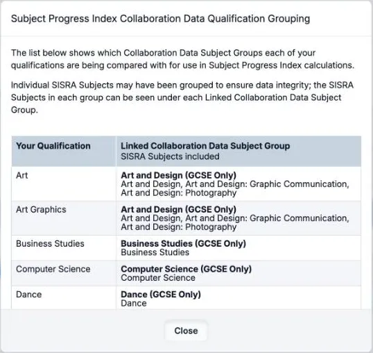
The people icon on the DATA COLLAB bar opens Subject Progress Index Collaboration Data Qualification Grouping. For each of Your Qualification, it gives the Linked Collaboration Data Subject Group and the Sisra subjects in it. In the demo school, Art and Art Graphics are both compared with Art and Design (GCSE Only). That group takes in art and design, graphic communication and photography.
A pupil’s SPI is blank when:
- the data set was not published with Data Collaboration on
- the pupil has no KS2 score, as in real 24/25 and 25/26 cohorts unless the school uploaded converted scores
- the collaboration has fewer than 10 grades for that subject group and KS2 score
Each qualification has its own SPI, so English language and English literature are compared separately. That differs from Progress 8, where the better of the two fills the English slot. Read SPI to compare subjects, alongside residuals, not as a subject Progress 8, which the DfE does not publish.
What the figures are and are not
Section titled “What the figures are and are not”Collaboration figures are an early comparison with other schools that use Sisra. In 2026, the first figures were available at 3:45pm on GCSE results day. They are not national figures:
- they come only from schools that opted in, finished the set-up and passed Juniper Education’s checks
- they are collected around results day, before re-marks, late results and the DfE’s checking exercises
- the 2025 and 2026 events rest on converted KS2 scores, because those cohorts took no KS2 tests
- for a current cohort’s assessments, they are an earlier year’s exam results, such as 2024’s
A report keeps the figures it was published with. When the DfE publishes its estimates for a year, your administrator can republish that cohort’s reports with them. Progress 8 and value added then use the DfE’s figures. Why it is not national data explains each limit.