


 Sonar Tracker
Getting started
Get started as a senior leader or governor
This tutorial is a first route through the reports in Sisra Analytics for senior leaders and governors. It starts with a cohort’s headline figures, then compares data sets, looks at trends and groups, and ends with the sixth form. Work through it with Sisra open. Then read what the figures can and cannot tell you before you take any of them to a meeting.
The examples come from Juniper Education’s demo school. Its 26/27 cohort is this year’s year 11, and its 25/26 cohort left year 11 in summer 2026.
Before you start
Section titled “Before you start”You need:
- a Sisra account, which you sign in to through Juniper Portal with your work email address (see Sign in and switch schools)
- an authority group that can open the reports you need
- to know what your school publishes, and whether each collection holds working-at, predicted or target grades
The User group opens every report except Locked reports and results under embargo. Senior leaders who check reports before staff see them usually need a custom group with View Locked Reports as well. Ask your Sisra administrator, and see Create a custom group.
Open a cohort’s headline figures
Section titled “Open a cohort’s headline figures”- Select REPORTS, then the KS 3/4 tab.
- Select the cohort’s tab. For last summer’s results, choose 25/26 (Leavers). For this year’s year 11, choose 26/27 (Yr 11).
- Select a folder, such as Year 11 Data, then the arrow beside a report, such as Exams.
- Under Headlines, select Whole Cohort.
The Headlines Summary opens. Each table holds a group of measures, such as Attainment 8 and Progress 8, English and maths, and the English Baccalaureate (EBacc). The beige columns are your school’s figures. The blue columns give the same measure across the schools in Sisra Data Collaboration, and your school’s figure minus it.
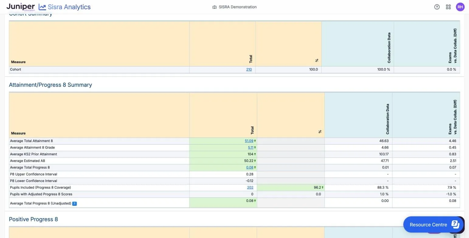
A school figure is 51.09 ↑ light green with an up arrow when it is better than the collaboration figure. It is 8.6 ↓ pink with a down arrow when it is worse. In the demo school’s 2026 results, 116 of 210 pupils (55.2%) achieved grade 5 or above in English and maths, against 45.9% in the 2026 collaboration.
Headlines reports explains every table. The Dashboard and Charts reports, on the Headlines menu of the area bar, show the same figures as tiles and charts.
Check what you are looking at
Section titled “Check what you are looking at”Before you quote a figure, check three things:
- its status. A green smiley face beside an expanded report means Checked: the data “has been finalised and verified”. Unchecked data “may be subject to change”
- what kind of grades it holds. Dataset Info, beside an expanded report, gives the grade type, such as Predicted, and the estimates used
- your own settings. Sisra keeps your filters and comparisons for up to 48 hours, so look for green numbers on the tabs above the report
Progress 8 for recent leavers
Section titled “Progress 8 for recent leavers”Progress 8 returns for this year’s year 11, who took KS2 tests in 2022. Until the DfE publishes its 2027 estimates, their Progress 8 uses an earlier year’s. An orange banner says the figures “should be used for internal analyses only and must be treated with great caution”. Juniper’s advice of 12 October 2026 is to publish current KS3/4 cohorts with the DfE’s 2024 estimates and the 2024 Data Collaboration. See What returns for 2026 to 2027.
Compare predictions with targets
Section titled “Compare predictions with targets”- Open the Headlines Summary for an assessment collection, such as Y10 Summer, and select the Dataset tab.
- Open the Compare list and select V next to the data set to compare with, such as KS4 Targets.
The report adds the second data set’s figures beside the first. The colours now compare the two data sets: light green is higher than the other figure, and pink is lower.
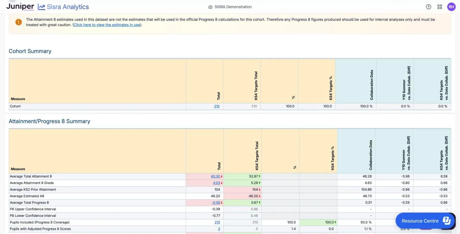
In the demo school, the year 10 summer predictions give an average Attainment 8 of 40.30, against 52.87 in the targets. Compare data sets that mean the same kind of thing, such as end-of-course predictions with end-of-course targets. Read the numbers as well as the colours, because some equal figures are coloured too. Compare lists what it adds to each report.
Look at trends
Section titled “Look at trends”- Select REPORTS, then the KS 3/4 tab.
- In the Qualification and Headline Trends Reports banner at the top, select VIEW THE HEADLINE TRENDS REPORT.
The banner shows only if your authority group has View Qualification Report.
KS3/4 Headline Trends sets each year’s exam results side by side, from Exams data sets. A figure is light green with a rising arrow (↗) when higher than the year before, and pink with a falling arrow (↘) when lower.
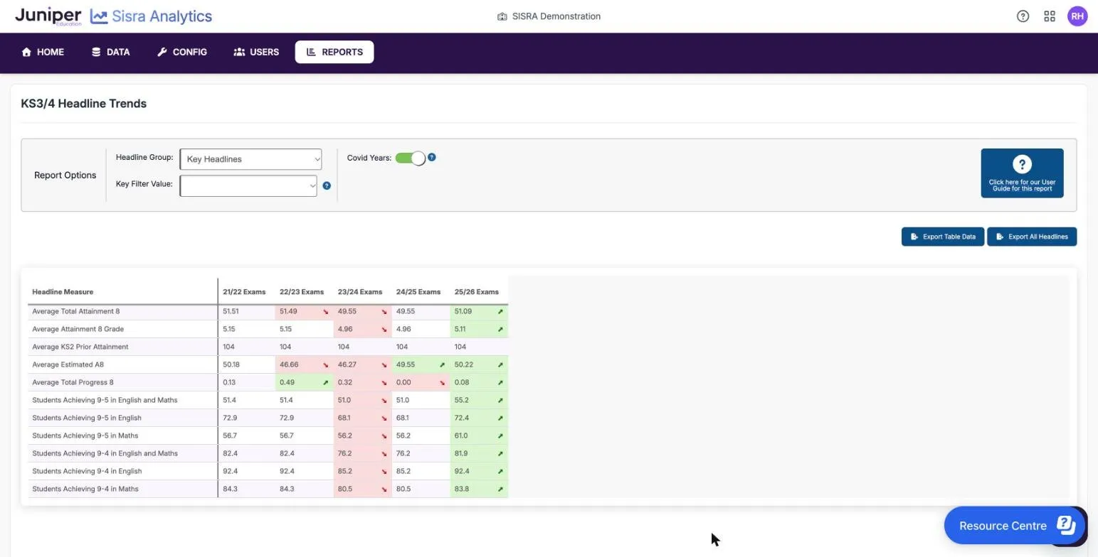
In the demo school, average Attainment 8 fell from 51.51 in 21/22 to 49.55 in 23/24, then rose to 51.09 in 25/26. Headline Group: chooses the measures. Key Filter Value: shows one group, such as disadvantaged pupils, if your school has mapped its key filters in every cohort. A year appears once its Exams data set is published with headline figures. See Headline Trends and Qualification Trends.
Look at three years or more before you call a change a trend. For your own 24/25 and 25/26 cohorts, the Progress 8 row is blank unless your school uploaded converted KS2 scores.
Look at disadvantaged pupils and other groups
Section titled “Look at disadvantaged pupils and other groups”- In the Headlines Summary, open the Breakdown : list on the toolbar.
- Choose a filter, such as Disadvantaged.
Each measure now has a row for All and a row for each group. For a filter with two values, most measures also get a GAP row: the first group’s figure minus the second’s. A blue diamond in the list marks a key filter. For a key filter, the collaboration columns show the same group in other schools, so disadvantaged pupils are compared with disadvantaged pupils.
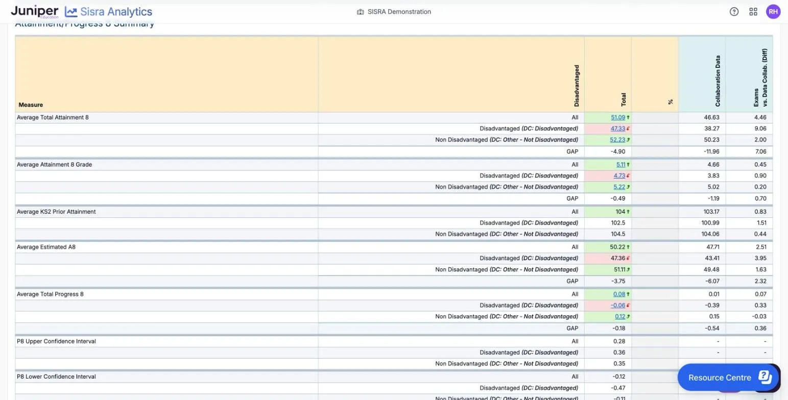
In the demo school’s 2026 results, the 49 disadvantaged pupils averaged 47.33 in Attainment 8, against 52.23 for the other 161 pupils. The gap of −4.90 compares with −11.96 for the same groups in the 2026 collaboration.
To see every group at once, select Headlines on the area bar, then Filters. The Filters report gives one row for each value of each filter, with the number of pupils in it. Many rows are small: in the demo school, the 100% attendance group is 5 pupils. The key icon, Key Characteristics, shows how many pupils have each value.
Look at the sixth form
Section titled “Look at the sixth form”- Select REPORTS, then the KS5 tab.
- Choose the cohort under CURRENT COHORTS, such as 26/27 (Yr 13), or a past year from LEAVERS.
- In DATA SET, choose the data set or collection, such as Exams or Assessments - Y12 Spring.
- Under STANDARD REPORTS, select Headlines.
The KS5 Headlines report has a table for each performance cohort, such as A Level, Applied General and Tech Level. L3 Overall covers every approved level 3 qualification: it is Sisra’s own cohort, which the DfE does not report. Each level 3 cohort’s table gives average points per entry, also shown as a grade, and value added (VA) with its confidence limits. Further tables cover best 3 A levels, AAB, and English and maths progress. AAB counts students with AAB or better in three A levels, at least two in facilitating subjects.
In the demo school’s Y12 Spring predictions, L3 Overall Average Points per Entry is 32.90, a C+. L3 Overall VA is 0.29, with confidence limits of 0.20 and 0.38. A VA of +1.00 is one grade above expectation in an A level. Both limits are above 0, so on these predictions students are ahead of similar students nationally in 2025.
For a current cohort, VA is an internal estimate. The DfE works out national value added only after each year’s results. So a blue triangle beside the figure says it was “Calculated using ‘2025 Revised’”, and that it “should be used for internal analyses only”. Unlike Progress 8, the DfE publishes level 3 value added for the 2025 and 2026 leavers.
Select Value Added under STANDARD REPORTS to see each qualification’s VA.
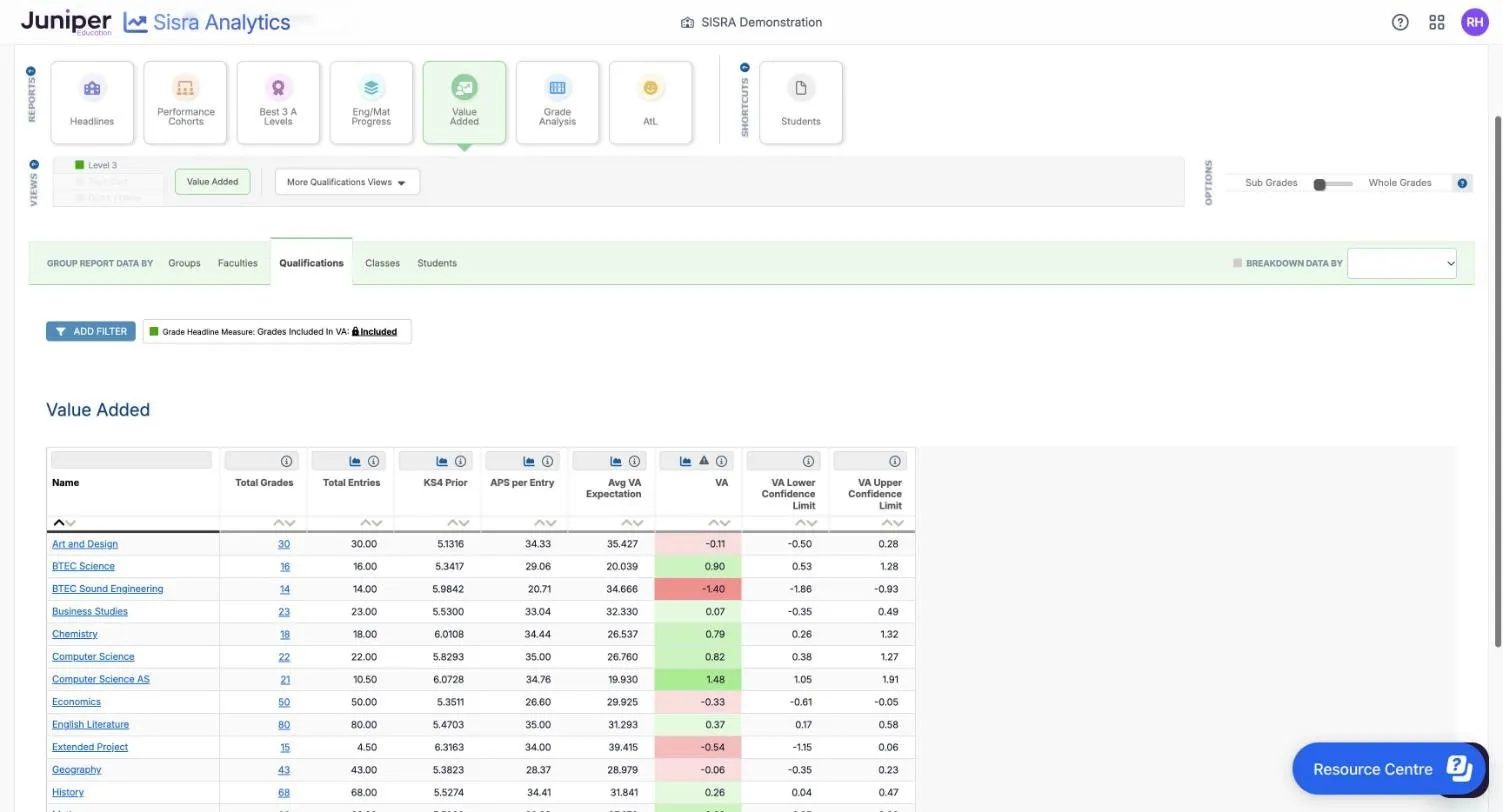
Maths has a VA of 0.62, and both its limits, 0.35 and 0.88, are above 0. Art and design is −0.11, in pink, but its limits of −0.50 and 0.28 span 0. So it is not significantly different from similar students nationally. Read the limits as well as the colour.
COMPARE WITH and BREAKDOWN DATA BY work as Compare and Breakdown : do at KS3/4. The KS5 tab has its own trends banner. See Open the KS5 reports, Headlines and Performance Cohorts reports and Value Added report.
What the figures can and cannot tell you
Section titled “What the figures can and cannot tell you”| Figure | What it can tell you | What it cannot tell you |
|---|---|---|
| Collaboration figures | How your results compare with other schools that use Sisra and opted in | National figures. They come before the DfE’s, from a different set of schools |
| Predicted and working-at grades | Where teachers think pupils and students are heading, and where to look first | What they will get. In one study of GCSE forecasts, 42.4% were too high and 14.0% too low |
| Progress 8 or VA for a current cohort | A rough view of progress, against an earlier year’s national figures | The DfE’s figure. The DfE’s 2025 accountability guidance says schools “should not try to predict pupil or school level progress scores in advance” |
| Confidence limits | Whether a score is significantly different from the national average. If the limits span 0, it is not | Why it differs |
| Small groups | Which pupils or students to talk about | A steady percentage: in a group of 4, one pupil is worth 25 percentage points |
| Residuals | How a subject compares with the same pupils’ other subjects in your school | How it compares with other schools, because residuals always balance out |
Sisra’s figures can also differ from the DfE’s for the same year. The DfE uses checked data, late results and re-marks, and estimates for the pupils’ own year. See Where Sisra differs from the DfE, and Good practice with school data for the evidence behind this table.
What governors should see
Section titled “What governors should see”The DfE’s 2018 report ‘Making data work’ advised that governors “should not routinely see data on individual pupils, ‘flight paths’ or other teacher judgement tracking data”. Most boards need a short summary, not a login:
- validated results, such as the Exams figures once they are Checked, beside the collaboration figures or, later, the DfE’s
- trends over three years or more, from Headline Trends
- gaps for groups such as disadvantaged pupils, with the number of pupils or students behind each figure
- the school’s own explanation of what the figures show and what it is doing about them
If governors use Sisra, give them a custom authority group with only the actions they need. For example, View Headline Report opens the whole-cohort figures, and leaving out View Student Report hides the pupil level. That does not make the data anonymous, because a filter can narrow a figure to one person: see What groups do not control. To reach Headline Trends, the group also needs View Qualification Report, which opens the qualification and class levels too.
Juniper Portal takes its list of staff from your school’s management information system (MIS). So a governor needs a record there, with an email address, before your administrator can invite them.
Exports and printouts hold personal data. Take names out of anything you share with the board, and store and delete papers as your school’s data protection policy says.
Inspection and internal data
Section titled “Inspection and internal data”Ofsted’s school inspection toolkit, for inspections from 7 September 2026, says: “Inspectors will not review internal data”. Inspectors may ask how leaders use assessment information and what they do as a result. You do not need to prepare Sisra reports for an inspection. See What Ofsted looks at.